Showing posts with label paint color. Show all posts

Tuesday, January 8, 2013

Do you need Visual Vigor for your home decor?


Have you seen it on the runway? Everyone is talking about....Emerald green. It's a new year, do you need a breath of freshness in your home decor? Try introducing emerald green,the hot new interior design color that will have you dancing to a new tune. You don't have to do a whole room like the one pictured below ( although I do adore the high gloss emerald ceiling.) You can add new flatware to your dining room or paint an entry table or chest to add visual vigor to any part of your home! 


 Shoes, wallpaper, fabrics and accessories are all  bathed in  emerald green the hot new jewel- toned color.

 Black is the perfect accent color with emerald green. It  calms the emerald color and gives it a grounding foundation.


 Blue and green have an even calmer appeal when used together as pictured below. Emerald is a soothing yet visually vibrant color...this color evokes an interesting mix of emotions. I hope you have found some inspiration to add some fresh ideas to your home decor! If you need help figuring our what color to paint help is a phone call away. Kimberlee Jaynes Interior Designs Inc. 503. 407.9525


Thursday, December 20, 2012

COLOR Interior Design Trends 2013


Every year new colors come in and are used in everything from paint, furniture, accessories, to cars and appliances. While other colors become passe'. I know what you are thinking " Oh great now I have to change my look again!!!" Calm down put your feet up sip a comforting drink and read my predictions... there is nothing to be afraid of...there really is something for everyone!

My predictions for 2013 are based upon the Pantone released  color matching system. Learn more about pantone here

Emerald  is a big color this year followed by purple, lavender and blush. Sea glass greens and turquoise are fresh and timeless. Neutrals ...grays, browns and graphite are perfect for the shy of color. They continue to be strong leaders for the sophisticates. Cuisine inspired curries have replaced orange for the hot new color--YELLOW.  I hope these images inspire you to think about color in an enlightening way sprinkle in the new colors with the decor you already have. Perhaps a pillow or lamp maybe a new art piece. You don't have to change everthing to stay au-current besides I like what renowned designer Billy Baldwin said about interior design:

"Be faithful to your own taste because nothing you really like is ever out of style."  

 Lets get started--LOVELY Lavender ... you can get lost in this combination of lavender & bottle blues. It feels ethereal and other-worldly. Camel colored grass cloth is the perfect foil behind the tufted sofa, keeping you tethered to earth. 

The following photos are from one of my favorite interior stylist Hilary Robertson . She owns a store in New York city. 
Denim paired with lavender also anchors lavender and makes it less girlie.

 Blush is one of my favorite new colors paired with a warm gray it creates the perfect background for your collection of black and white art work.


Glorious Graphite 


"If you are a collector, let other people share your pride and joy. Don't sprinkle your collection out of sight in a meaningless jumble. Notice how groups of small objects, when they are well arranged, become important and effective. Remember that repetition is a form of emphasis. Collect what you will, but see to it that you arrange your hobby to its best advantage."
Dorothy Draper 


The soothing influence that very little color has on a space...is magical. collections seem uncluttered...time seems to stand still under the influence of neutrals.


"Birds are so much wiser than we! A robin builds a nest for robins. A seagull builds a nest for seagulls. They don't copy each other - or build themselves nests as described in The Birds' Decorating Magazine."  Dorothy Draper 

  From robins egg to Sea glass blue
all blues this season are fresh and forever young. 


Cuisine inspired colors:Green Tea & Curries... 


As I mentioned in the beginning of this post there is something for everyone...with global climate zones...all colors are embraced. Here we have the rich deep palette pleasers. Paprika, rose hip,parsley,cumin, curry and coriander. If you don't want these colors to dominate your decor (like the a settee pictured below) you can use them as accents colors in pillows or in paint colors. 


Sunday, December 4, 2011

The power of a paint color!


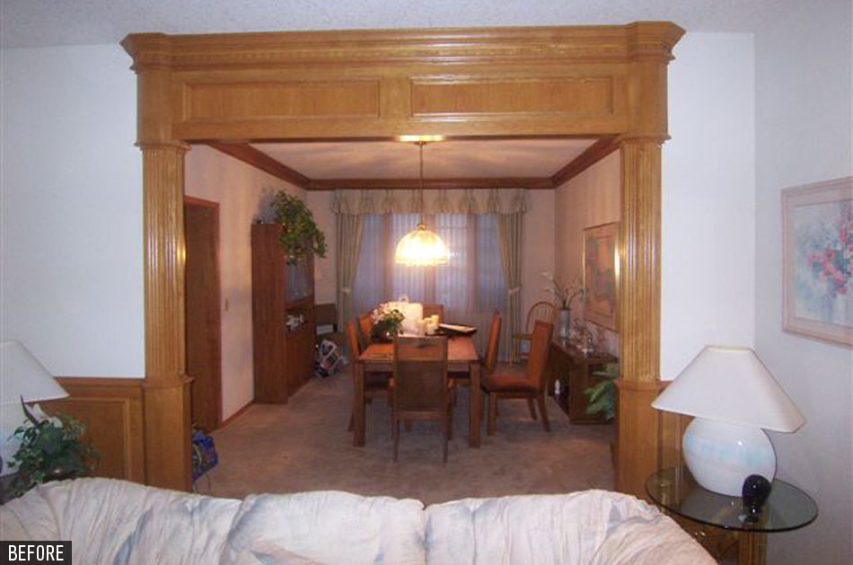
This is one of my favorite before and after examples on the portfolio page or my website! The 1980s oak was immediately updated with the addition of a paint color that brightened and lightened the whole mood of this house. The wood work no longer takes center stage but now is a supporting player to the bold performances in constrasts. Using black and red as my accent colors, gives the room high drama...this is exactly what my clients wanted ...a place of comfortable luxury. Kimberlee Jaynes Interior Designs specified the twin sofas used in the living room. This room is long and not as wide as I would have liked...but these custom curved sofas fit perfectly into the space. The gentle curves softens the angular shape of the room and takes the focus off the once dominating wood work. The starburst pattern dining table with inlaid wood, the crystal chandelier and black buffets, all add up to an atmosphere of fine dining.

Friday, December 2, 2011

The sanctuary...the master bedroom at Acorn Hill estate


Continued Kimberlee Jaynes Interior Designs,Inc photos of the master bedroom at Acorn Hill. The master bedroom looks out on extensive grounds peppered with blue and white hydrandias.
I chose the bed linens and built the room around them. The blue walls, pinstriped silk curtains and damask patterned bedding all add a soothing feel to this retreat. The homeowner already had the olive green velvet chair, we thought it worked well with the stem of the hand embroidered hydrangeas on the crown over the sleigh bed. The muted wool Tufenkian carpet adds to the
" always been here" look. The homeowners teenage daughter made the art piece to the left of the bed...extrodinary! Without this modern touch...it would look too old world for this young family.

Wednesday, October 26, 2011

Personality Plus! What does your home say about you?

Kimberlee Jaynes Interior Designs was initially hired to design the entry and guest bathroom only, in this beautiful Elizabeth condo located in the Pearl district of NW Portland. It all transpired while my client went on a trip to Italy.
Upon her return she said " Good news and bad news, the good news is I love what you've done ! The bad news is I don't like the rest of my condo!" The design challenge: Bring the whole space up to speed and introduce much needed visual interest to each room.

The entry now has a bold playful runner beckoning you to come further and explore. Metallic gold backed grass cloth in the once dark entry, lights up this space and adds texture and visual warmth. The red lacquer mirror is just what was needed over the console table topped with the silver ceramic rectangular lamp and mesh shade.

I used a warm brown with subtle flurries of silver hand painted wall paper from Maya Romanoff in the guest bathroom. The one of a kind graceful curved shelf /sculpture is just what this previously barren bath needed. I had a metal fabricator execute my design. The shelves are remnants of rich brown/gray paper stone (a solid surface product) and the metal tubing is powder coated in a silvery taupe, it won't rust in the most humid conditions.

In the living room I added a flue-less fireplace complete with a granite mantel that ties in with the adjoining kitchen counter tops. The maple wood panels compliment the kitchen cabinetry. Ann Sacks tile in a luminescent Carmel surrounding the firebox continues the reflective elements I have spun throughout this condo. As permanent as the fireplace looks it is simply hung with a French cleat! The client can take it with her if she moves. The living room rug is called "Daisy Mae" from Tufenkians. It adds the punch of color that I needed to bring this room to life.

The lipstick red hide-a-bed carries the "I'm not afraid of color" theme from the living room into the TV room.

The bedroom and en-suite bath are awash in serenity and artistry. I used metallic paper in earth and silver, shot with small irregular pin dots of teal blue in the bedroom. (The cement pilaster is no longer the focal point ) The French Quarter linens and pear shaped glass chandelier with mirrored bed and side tables and opulent draperies all say" I'm ready to relax in luxury." Another Tufenkian area rug under the bed repeats the atmospheric blue I used in the ceiling color. The artwork from Butters Gallery adds the modern touch to this classic timeless bedroom.

My client was a delight to work with and I applaud her willingness to stretch her design boundaries and am grateful for her trust in me.

click on the photo to enlarge.