Showing posts with label Color Trends. Show all posts

Thursday, December 20, 2012

COLOR Interior Design Trends 2013


Every year new colors come in and are used in everything from paint, furniture, accessories, to cars and appliances. While other colors become passe'. I know what you are thinking " Oh great now I have to change my look again!!!" Calm down put your feet up sip a comforting drink and read my predictions... there is nothing to be afraid of...there really is something for everyone!

My predictions for 2013 are based upon the Pantone released  color matching system. Learn more about pantone here. 

Emerald  is a big color this year followed by purple, lavender and blush. Sea glass greens and turquoise are fresh and timeless. Neutrals ...grays, browns and graphite are perfect for the shy of color. They continue to be strong leaders for the sophisticates. Cuisine inspired curries have replaced orange for the hot new color--YELLOW.  I hope these images inspire you to think about color in an enlightening way sprinkle in the new colors with the decor you already have. Perhaps a pillow or lamp maybe a new art piece. You don't have to change everthing to stay au-current besides I like what renowned designer Billy Baldwin said about interior design:

"Be faithful to your own taste because nothing you really like is ever out of style."  

 Lets get started--LOVELY Lavender ... you can get lost in this combination of lavender & bottle blues. It feels ethereal and other-worldly. Camel colored grass cloth is the perfect foil behind the tufted sofa, keeping you tethered to earth. 

The following photos are from one of my favorite interior stylist Hilary Robertson . She owns a store in New York city. 
Denim paired with lavender also anchors lavender and makes it less girlie.

 Blush is one of my favorite new colors paired with a warm gray it creates the perfect background for your collection of black and white art work.


Glorious Graphite 


"If you are a collector, let other people share your pride and joy. Don't sprinkle your collection out of sight in a meaningless jumble. Notice how groups of small objects, when they are well arranged, become important and effective. Remember that repetition is a form of emphasis. Collect what you will, but see to it that you arrange your hobby to its best advantage."
Dorothy Draper 


The soothing influence that very little color has on a space...is magical. collections seem uncluttered...time seems to stand still under the influence of neutrals.


"Birds are so much wiser than we! A robin builds a nest for robins. A seagull builds a nest for seagulls. They don't copy each other - or build themselves nests as described in The Birds' Decorating Magazine."  Dorothy Draper 

  From robins egg to Sea glass blue
all blues this season are fresh and forever young. 


Cuisine inspired colors:Green Tea & Curries... 


As I mentioned in the beginning of this post there is something for everyone...with global climate zones...all colors are embraced. Here we have the rich deep palette pleasers. Paprika, rose hip,parsley,cumin, curry and coriander. If you don't want these colors to dominate your decor (like the a settee pictured below) you can use them as accents colors in pillows or in paint colors. 


Sunday, December 4, 2011

The power of a paint color!


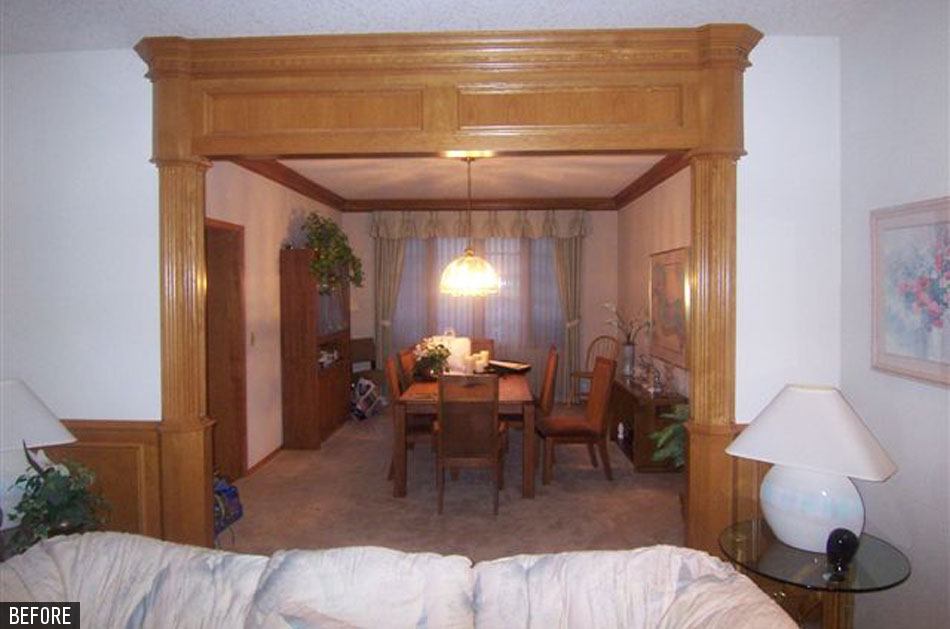
This is one of my favorite before and after examples on the portfolio page or my website! The 1980s oak was immediately updated with the addition of a paint color that brightened and lightened the whole mood of this house. The wood work no longer takes center stage but now is a supporting player to the bold performances in constrasts. Using black and red as my accent colors, gives the room high drama...this is exactly what my clients wanted ...a place of comfortable luxury. Kimberlee Jaynes Interior Designs specified the twin sofas used in the living room. This room is long and not as wide as I would have liked...but these custom curved sofas fit perfectly into the space. The gentle curves softens the angular shape of the room and takes the focus off the once dominating wood work. The starburst pattern dining table with inlaid wood, the crystal chandelier and black buffets, all add up to an atmosphere of fine dining.

Friday, October 7, 2011

Fashion Dictates Interior Design Color Trends 2012


As always the fashion runway gives us in the interior design field, the color trends headed out way. " Color Blocking " has been around since I was a fashion stylist at Nordstrom in the 1980's but some how it gets recycled every so often as a new trend. Here it is again in the Fall issue of Vogue magazine. People want to live with color more than just during the summer months. So how do you input color into your interior design without looking like a comic strip? Just like the models pictured above...black, sand,white and gray are perfect grounding colors for all those primary colors. Start with a neutral pallete and add one or two vibriant colors.
The photo below is from Kimberlee Jaynes Interior Designs Inc. portfollio. The use of neutrals gives your eye a place to rest and creates a platform for the colors to perform.

Monday, December 27, 2010

Interior Design Trends 2011-2012

What's on trend for 2011?
There are many trends happening in the world of interior design. Here are a few of the main trends that I am seeing.

TECHNO CHIC: Aims to provide you with one-of-a-kind products that are both functional and fashionable. Furniture and equipment recalls Working/Dressing: steel cabinets that mimic safes, but with stylish perforated panels and doors. Corrugated and perforated metal sheets are widely used in furniture and open shelves, partitions and other items. Chairs of bent pipe or sheet metal, stools, resembling the lunar rover – all with personalize technology.
High Tech Kitchen

URBAN ZEN:This trend will stem from consumers reassessing what they need to live comfortably, with minimal furnishings in natural materials. Each piece of furniture will be selected for not only it's purpose but it's visual desirability. British textile designer Claire-Anne O’Brien has created a collection of stools that feature a variety of knitted seat cushions. A clever rethinking of what form the ordinary stool can take.

ETHNIC ENVOY: All nationalities are celebrated in this trend. Lots of color and pattern reemerging this year. Ethnic pieces give your home instant history in this fast paced disposable world. African masks mixed with French antiques, Moroccan textiles upholster sofas.


CELEBRATION: This trend is towards levity in our all too serious global society. We are tired of the bad news and want to "create" our own good vibe. We want to believe all things are still possible. This trend is all about Over Sized Florals! Geometrics on Steroids! Every pattern that was tame in the past is now pumped up to a new volume! Let the celebration begin!


Benjamin Moore's Paint trends for 2011-2012

Preserve and Protect is the connection between human beings and their environment.
Our lives are enriched by conservation and enhancing the natural world. Preservation is a call to embrace the wonder of nature and the rhythms of its changes. The journey along the way becomes as important as the outcome.
For 2012, four key elements support the theme of Preservation: Heritage, Process, Protection, and Enlightenment. We are enlightened to move forward towards a kaleidoscopic vision for a sustainable future.

One purple to watch for in 2011 is Benjamin Moore’s Vintage Wine 2116-20," said Sonu Mathew, ASID, the company's senior interior designer, who also blogs about color and design at livingincolorwithsonu.typepad.com. It is an anchoring and rich hue with a deep brown base and a hint of smoky violet. Vintage Wine is the perfect foil for the latest wood finishes, leathers, linens and other textiles."

But, for anyone who wants purple with a little more punch, Mathew says, Royal Flush 2076-20 is a sure bet for 2011. This berry-kissed Benjamin Moore color can be grounded when combined with neutrals or fashionable grays, yet swings to the exotic when teamed with other brights.

Mathew also noted there’s a range of pale yet power-statement colors headed our way in 2011. A standout among this group is Benjamin Moore’s Smoke 2122-40. "It is a subtle blue gray that is best described as an update of spa blue with an injection of sophisticated and seasoned gray."
According to Mathew, a quest for balance is what’s driving our choices in life, and, thus, is the overarching trend that is influencing the 2011 palette.


Cues and Clues
for 2011 Colors. 
In arriving at its 2011 color palette forecast, the Benjamin Moore color team first tracked recent cultural, social, and even political conditions and how they are impacting fashion and design trends. Emerging from this analysis were the central Balance theme plus three distinct offshoot style movements—Soulful, Spirited and Dreamy. These were then defined by the following Benjamin Moore colors.


Soulful
…
A global balance is being achieved as communications technology shrinks the oceans and miles between us, and as what once was foreign blurs into familiar. On the style front, this is visible in "ethnic glam" designs, pattern-on-pattern, map motifs and hand-worked decoration such as beading and embroidery. Colors being called out to interpret this not only include Benjamin Moore’s Vintage Wine, but also Wasabi AF-430, Amulet AF-365, Casco Bay 2051-30, Hush AF-95, and Etruscan AF-355.

Spirited…
The antidote to stress is anything that makes you feel happy, joyful, playful. Striking that emotional balance can be a challenge. In fashion and furnishings it’s reflected in spirited designs featuring geometrics, stripes and cubes, dots and curlicues, studded or stitched outlines of shapes and silhouettes. Riotous colors are juxtaposed with lots of gray, black and white. Colors comprising this palette are the aforementioned Royal Flush, as well as Grape Green 2027-40, Wrought Iron 2124-10, Paper Mache AF-25, Storm AF-700, and Lucerne AF-530.

Dreamy…
Reality can be harsh and is best countered by a dreamy odyssey where wishes are nurtured. Translated into a design perspective, that means transparent and sheer materials, blurred decorative details and softened textures. As for the color palette, imagine Benjamin Moore hues that are pale, frosted and opalescent, such as Gray Mirage 2142-50, Genesis White 2134-70, Porcelain 2113-60, Etiquette AF-50, Kendall Charcoal HC-166 and the previously cited Smoke.

Thursday, March 25, 2010

Sets for the Artist Marina Abramovic’s Dramatic Life

FOR Marina Abramovic, a 63-year-old Yugoslavian-born performance artist, the star is a potent symbol, and it makes frequent appearances in her work. Ms. Abramovic, whose retrospective, “Marina Abramovic: The Artist is Present,” opens this month at the Museum of Modern Art, constructed and set a large star on fire in an early piece, lying down inside it. During another widely publicized performance, she carved a star around her navel in what she describes as an anti-Communist act.

“I come from a Communist country,” she said. “The star is on my birth certificate and on every book in the school — they remind me of the restrictions of freedom.”

So it’s no accident that the house she owns in Malden Bridge, N.Y., in Columbia County, is star-shaped.

It took “30 seconds” to make the decision to buy it, she said. Not only did the shape have personal significance, she explained, “it’s a beautiful harmony of space and light, and a 360-degree view.”

Like Ms. Abramovic’s loft in SoHo, where she will spend most of her time while her show is at MoMA, the 3,400-square-foot house was designed by Dennis Wedlick, a Manhattan architect. It was built in the early 1990s for a doctor and his three adult children, so that every member of the family could have his own wing. (Each of the four bedrooms on the third floor occupies a different point of the six-pointed star; the two bathrooms are in the remaining points.)

But when Ms. Abramovic, a self-described minimalist, bought it in 2007, for $1.25 million, she said, there were murals painted throughout the house and the floors were a grainy yellow pine that she hated.

“The house was heavy,” she said.

That’s how she met Mr. Wedlick.

Ms. Abramovic, who is not known for her reticence, simply called and left him a message saying, “This is Marina. I just bought your star house, and I have a sofa arriving tomorrow, and I need you here.”

“It caught me off guard,” said Mr. Wedlick, who had no idea who Marina was. It took him two weeks to call her back, he said, but when they finally met, “I totally fell in love with her. She has the most ordinary persona for someone who does such extraordinary, controversial work.”

“Marina doesn’t point out details,” he continued. “She only tells you one or two ideas. She never changes her mind; she makes a decision and goes on.”

Perhaps because of that, he found her very easy to work with. “She said, ‘Dennis, make this white,’ ” he recalled. “She gave us $250,000 and eight weeks.”

Following Ms. Abramovic’s instructions to strip the house bare, he had the walls and ceilings painted white. The floors were refinished with a sealer called Bona Naturale, to soften the grain without adding sheen, so that they would be smooth and pale as well. Columns flanking some entrances were removed, as was the circular driveway.

“Americans like to park their cars in front of the house,” Ms. Abramovic said. “This is unacceptable. A car should be parked out behind the barn.”

There is still color, but in discrete bursts: the orange of a 1965 Olivier Mourgue Djinn Relaxer, the cobalt blue of a 1968 Bouloum chaise, the red of a 1968 Kazuhide Takahama Suzanne sofa.

“She likes bright colors as a sculptural piece, as a moment,” Mr. Wedlick said.

The renovation went so well that as soon as it was completed, Ms. Abramovic gave Mr. Wedlick $750,000 and four months to redo her city home, a 2,500-square-foot loft she had purchased in 2001 for $1.5 million. (Sean Kelly, her Manhattan gallerist, sells photos of her performances for between $40,000 and $350,000, which has helped finance her renovations.)

There, to eliminate any sign of messiness for his fastidious client, he structured the design around a 370-square-foot translucent cube that contains the kitchen, the dressing room, the laundry room and a guest bathroom, and can be closed off with aluminum-framed frosted-glass doors. Some of the kitchen cabinets are clad in turquoise-lacquered wood, others in Granny Smith-green glass.

“A city is so gray,” Ms. Abramovic said. “Green is healing to the eye.” When the cube is closed, she noted, it glows a soft blue-green, like a “light box.”From the New York Times